Fairness
Fairness review needs a chart that says, for each concept, how differently the model treated group A vs. group B. Per-feature disparity numbers are too granular for the conversation; the disparity heatmap rolls them up to the concept level.
When to use this
- Before any model launch where a protected attribute (sex, race, marital status, age category, …) is in scope of legal or regulatory fairness review.
- During incident response on a fairness complaint, to locate the concept the model treats differently across groups.
- As a periodic monitoring view: re-run on a recent slice and compare against the launch baseline.
The view
| Function | Returns | Use for |
|---|---|---|
concept_disparity + concept_disparity_heatmap |
Long-form (concept, group) → signed gap vs a reference group | "Which concepts does the model lean on more heavily for group A than for group B?" |
Minimal example
from concept_graph_xai import (
    concept_disparity, concept_disparity_heatmap,
)

# A protected-attribute column on X, or a separately built Series.
# Any number of groups is supported; every group is compared against
# the explicit reference group.
disp = concept_disparity(graph, feature_names, shap_values,
                         protected="senior_flag", reference="non_senior",
                         X=X)

concept_disparity_heatmap(graph, disp).show()
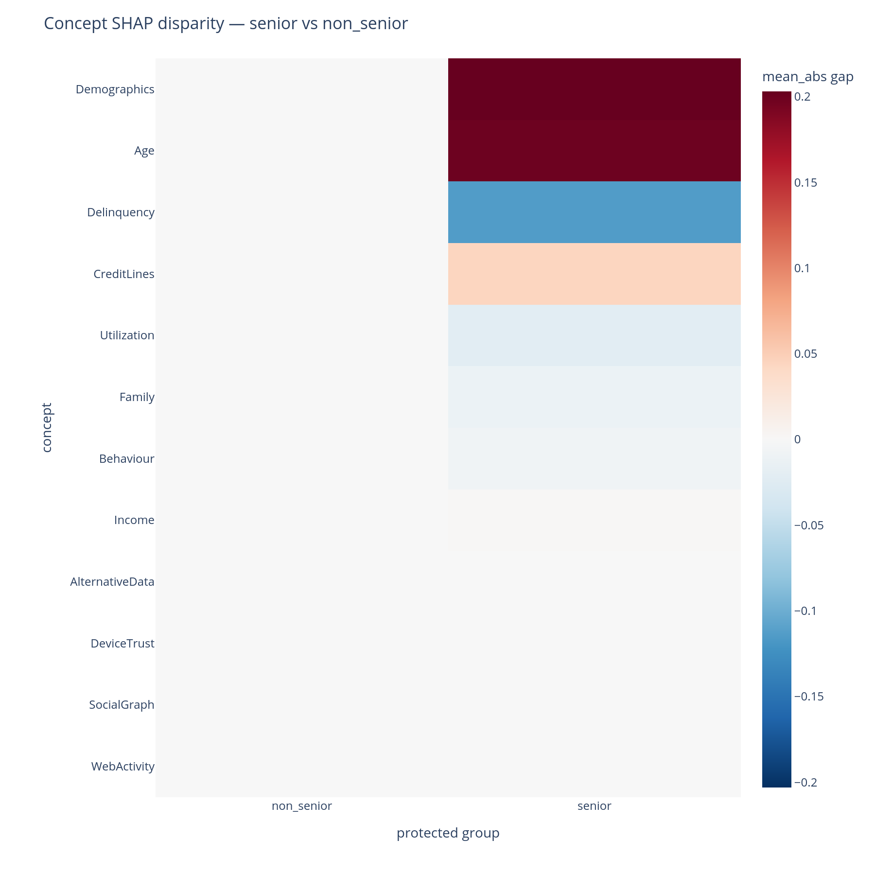
Reading the output
Rows are concepts (by default sorted by the maximum |gap| across
groups). Columns are protected groups, each compared against the
reference group; the reference group's own column is exactly zero
and is kept as a visible baseline (include_reference=False drops
it). Cell colour encodes the signed gap (a diverging palette
centred at zero):
- A red cell means that group received a larger mean|SHAP| contribution from this concept than the reference group.
- A blue cell means the reverse.
- A white cell means the model contributed comparably from this concept across the two groups.
The magnitude is in the same units as mean(|SHAP|). The default
"RdBu_r" colorscale is centred at zero so the colour scale is
comparable between cells.
What to do with the answer
- Investigate the largest-magnitude cells first. The disparity says the model treats these groups differently in this concept — the next question is why, which the cohort view, per-prediction waterfalls, and (often) an upstream-data audit can answer.
- Distinguish legitimate vs unjustified disparities with legal / business / domain context. The heatmap surfaces; it does not adjudicate. A disparity in Income across age groups is usually legitimate; a disparity in Demographics may not be.
- Pair with the cohort view on the same segments defined as protected groups. If the same concept lights up in both views, the model is consistently group-differential there; if only one view lights up, the difference may be a statistical artefact of cell sizes.
- Carry the flagged concepts into the tree-design review: a kitchen-sink concept that also shows large disparity is the highest-priority concept to split.
Common pitfalls
- Tiny cells. Groups with few rows produce mean|SHAP| estimates
with high variance — the disparity will look large even when the
underlying difference is sample noise. Inspect
X.groupby(protected_col).size()before reading. - Direction confusion. Every gap is
value_group -
  value_reference
. Withprotectedvalues{"senior", "non_senior"}andreference="non_senior", a red cell in theseniorcolumn means more contribution for seniors. Pick the reference deliberately — it defines the sign of every cell. - Multi-group width. With many groups, the heatmap grows one
column per group. For very many groups, slice the output to the
groups that matter or recode the column to a binary
versus-restflag before calling.
Related
concept_disparity,concept_disparity_heatmap— API reference.- Cohort — same plot shape, legitimate-business-segment framing.
- Per-prediction — single-row waterfalls to investigate a flagged concept on individual cases.
- How it works, Part G — the same answers in narrative form.